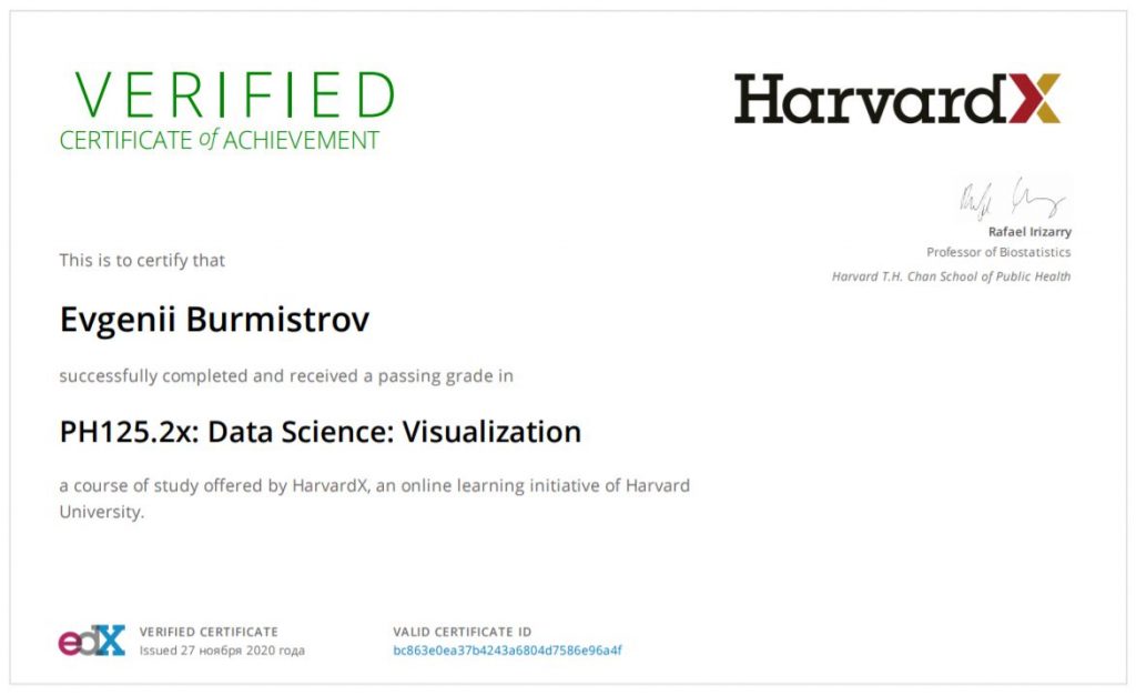
I finished another course by HarvardX on EdX. The second course was about data visualization and has two parts. The first part is about general rules for data visualization (like avoid pie charts and use the same axes for data comparison etc.). The second part is about ggplot2 package in R. I should say it’s rather a powerful and flexible tool. I have experience writing VBA scripts for excel plots and definitely, ggplot2 is way too easier and faster.
As I did before, I applied for financial support and got a 90% discount. So I was able to get a certificate for a reasonable price

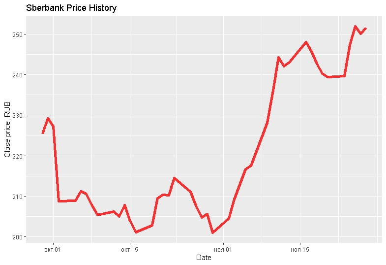
After completing of course I decided to apply new knowledge to our reality and made a plot of Sberbank stock price for the last 60 days. I took data from the Moscow exchange server using their API and then constructed from JSON file a data frame with dates and closed prices. Here is the code
library(jsonlite)
json_file="http://iss.moex.com/iss/history/engines/stock/markets/shares/boards/tqbr/securities/sber.json?from=2020-09-29"
jsonData<-fromJSON(json_file)
head(jsonData)
date_col<-as.Date(jsonData$history$data[,2], format='%Y-%m-%d')
data_col<-as.numeric(jsonData$history$data[,12])

df<-data.frame(date=date_col,cl_price=data_col)

head(df)
str(df)

df %>% ggplot(aes(x=date, y = cl_price)) +  geom_line(colour="red", size = 2, alpha=0.8) +
xlab("Date") +
ylab("Close price, RUB") +
ggtitle("Sberbank Price History")
And as a result, I got a good-looking plot created with five lines in two minutes.

I should say that the second course was more utilized, and most of the time was dedicated to practical issues. But as before, there were a lot of examples based on real data sets. So I very satisfied with this specialization so far.

