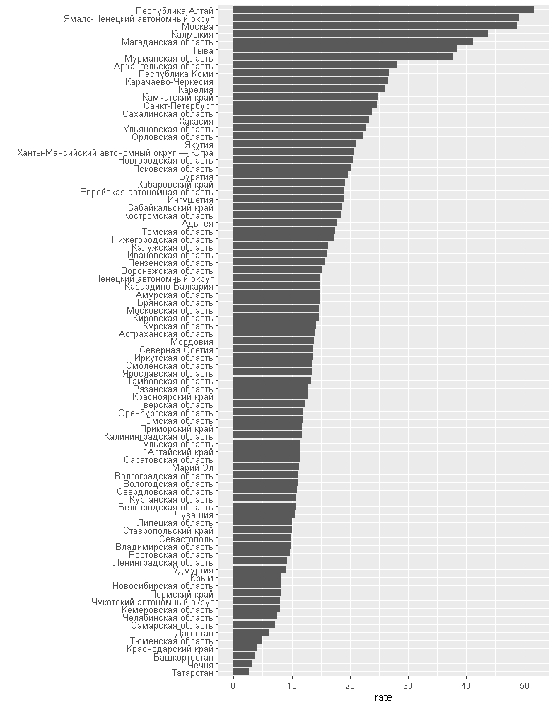
When I see statistics of COVID-19 spreading in Russia it’s really hard to say what’s going on. So, I decided to look at things differently and show infected people rate instead of absolute number.
I took the data actuan on Dec 1st 2020, added official population for each region based on Rosstat data compute rate of infected people for one thousand. As a result I came up with the following code
library(jsonlite)
library(readxl)
library(tidyverse)
json_file="https://api.apify.com/v2/key-value-stores/1brJ0NLbQaJKPTWMO/records/LATEST?disableRedirect=true"
jsonData<-fromJSON(json_file)
df <- read_excel("regions.xlsx")


df_plot<-data.frame(region=jsonData$infectedByRegion$region,infected=jsonData$infectedByRegion$infected, population=df$Population)


df_plot <- mutate(df_plot, rate = infected / population * 1000)


df_plot  %>%mutate(region = reorder(region, rate)) %>% ggplot(aes(region, rate)) +
geom_bar(stat="identity")+
coord_flip() +
theme(axis.text.y = element_text(size = 6)) +
xlab("")
As a result I got an interesting plot

It turned out, that Moscow is not the worst place to live now, In Altai region you chances to caught an infection is slightly higher. And Tatarstan with Chechnya looks like a safe heaven among other regions. But I have serious doubts in their data, of course

