Using ggplot2 requires you to begin to think of each element of a plot as a layer.
First, you have a white screen with only axes defined, two lines symbolizing the x and y axes. Using the ggplot() function, you layer on a dataset that contains what you'll plot and the aesthetics of the plot, defined in the aes() function, which corresponds to the things to plot and how to plot them. Then, you layer on a geom, which tells ggplot2 what kind of plot you're trying to make. You can layer on additional aesthetics, such as plot titles, axis labels, colors, different point types, and more.
In the call, we see the three things required by all ggplots:
- Dataset (DATA)
- Geom (GEOM_FUNCTION)
- Mappings (MAPPINGS)
Mappings are the variables you want to graph plus other aesthetics (aes() is short for aesthetics)
Global mappings will apply globally to every layer of your plot. This is a good place to put the variables you'd like to begin plotting and any settings you'd like to apply to everything, for example declaring alpha = 0.6 here would mean all of your points in a scatterplot are at 60% transparency.
Local mappings will either override or add to any global mappings and apply to that layer only. As you'll see later on, you can include a number of layers in your ggplot (either by plotting multiple variables or by adding layers that include titles or themes, for example), so any local mappings should be applied inside the geom_*() or appropriate function (for example, ggtitle()).
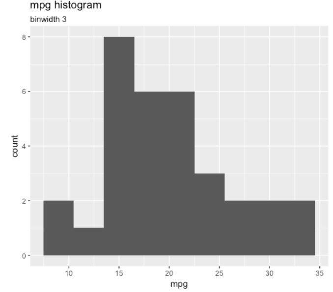
Histogram
When you have one continuous variable, it's a good idea to use a histogram to get an idea of its distribution. The height of the bar of the histogram corresponds to the number of observations that have that value. We can create a histogram of the mpg variable in mtcars using the following code:
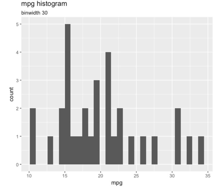
The default number of bins is always 30, and you should always change it and find a better value for your data. The default means that it takes the range of the data (here, mpg is between 10.4 and 33.9) and divides it by 30 to create bins—which, in this case, is a bit large, and causes our binwidth to be equal to 0.783, which is tiny!
Using a binwidth of 3 shows decent amount of detail, as shown in the following graph: