The plot() Function
The plot() function is the backbone of base plots in R. It provides capability for generic X-Y plotting. It requires only one argument, x, which should be something to plot—a vector of numbers, one variable of a dataset, or a model object such as linear or logistic regression. You can, of course, add a second variable, y, plus an assortment of options to customize the plot, but x is the only input required for the function to run successfully.
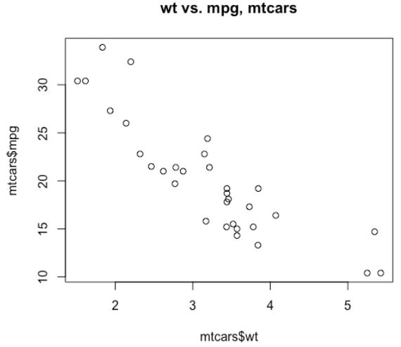
We can see a clear negative linear trend, that is, when the weight increases, the miles per gallon decreases.
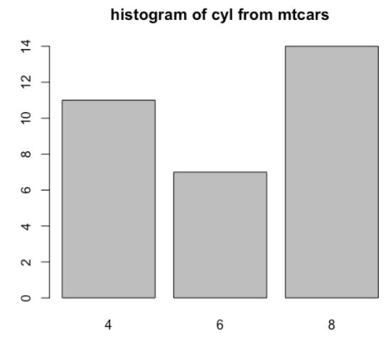
If we input it as a factor variable into plot, we get a bar chart (histogram) by default, where each bar gives a count of how many cars have each number of cylinders:
Model Objects
If you were to input a linear model object, plot() automatically returns four helpful model diagnostic plots, including the Residuals versus Fitted and Normal Q-Q plots, which help you determine whether your model fits well.
plot(mtcars_lm)
R can plot more than one plot at a time on the same viewing window. Inside of par(), if we pass mfrow = c(rows, cols), where rows is the number of rows of plots you'd like and cols is the number of columns of plots you'd like, you can plot a number of plots on the same screen.
par(mfrow = c(2,2))
plot(mtcars_lm)
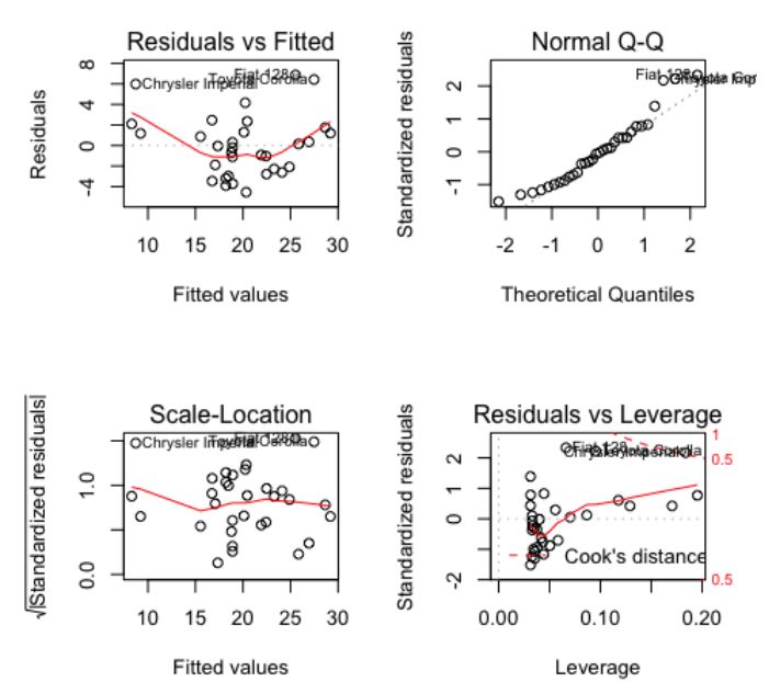
This resets your Global Options in RStudio. So now, every time you try and plot, it will make plots in a 2 × 2 grid. You'll need to reset back to 1 × 1 when you're ready, using either dev.off() or simply par(mfrow = c(1,1)).
Titles, Axis Labels and Colors
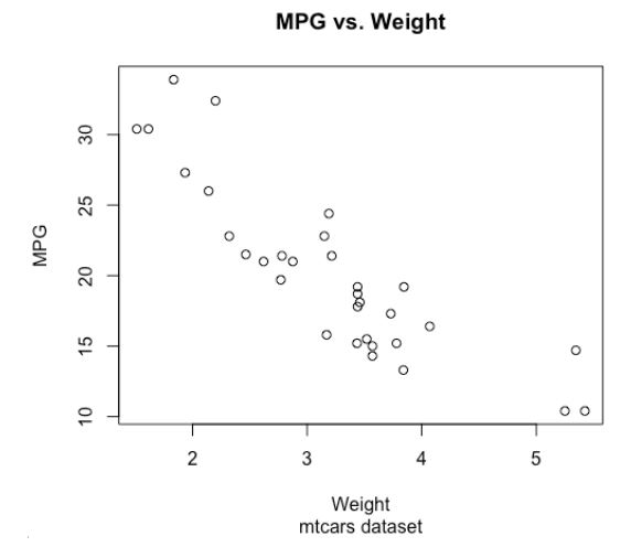
If we want to add a title and custom axis labels to a base plot, it is simply a matter of adding extra inputs to plot().
main = "MPG vs. Weight",
sub = "mtcars dataset",
xlab = "Weight",
ylab = "MPG")
If we decide we'd like to plot in a different color, say red, it's as simple as passing col = "red" into plot(). R supports the names of many different colors along with hexadecimal color codes. The code to change the previous plot to red would be as follows:
col = "red")