1 - Confidence Intervals of Polling Data
For each poll in the polling data set, use the CLT to create a 95% confidence interval for the spread. Create a new table called cis that contains columns for the lower and upper limits of the confidence intervals.
- Use pipes %>% to pass the poll object on to the mutate function, which creates new variables.
- Create a variable called X_hat that contains the estimate of the proportion of Clinton voters for each poll.
- Create a variable called se that contains the standard error of the spread.
- Calculate the confidence intervals using the qnorm function and your calculated se.
- Use the select function to keep the following columns: state, startdate, enddate, pollster, grade, spread, lower, upper.
library(dplyr)
library(dslabs)
data("polls_us_election_2016")
# Create a table called `polls` that filters by state, date, and reports the spread
polls <- polls_us_election_2016 %>%
filter(state != "U.S." & enddate >= "2016-10-31") %>%
mutate(spread = rawpoll_clinton/100 - rawpoll_trump/100)
# Create an object called `cis` that has the columns indicated in the instructions
cis <- polls %>% mutate(X_hat = (spread+1)/2,
se = 2*sqrt(X_hat*(1-X_hat)/samplesize),
lower = spread - qnorm(0.975)*se,
upper = spread + qnorm(0.975)*se) %>%
select(state, startdate, enddate, pollster, grade, spread, lower, upper)
2 - Compare to Actual Results
You can add the final result to the cis table you just created using the left_join function as shown in the sample code.
Now determine how often the 95% confidence interval includes the actual result.
- Create an object called p_hits that contains the proportion of intervals that contain the actual spread using the following two steps.
- Use the mutate function to create a new variable called hit that contains a logical vector for whether the actual_spread falls between the lower and upper confidence intervals.
- Summarize the proportion of values in hit that are true using the mean function inside of summarize.
add <- results_us_election_2016 %>% mutate(actual_spread = clinton/100 - trump/100) %>% select(state, actual_spread)
ci_data <- cis %>% mutate(state = as.character(state)) %>% left_join(add, by = "state")
# Create an object called `p_hits` that summarizes the proportion of confidence intervals that contain the actual value. Print this object to the console.
p_hits <- ci_data %>% mutate(hit = lower <= actual_spread & upper >= actual_spread) %>% summarize(proportion_hits = mean(hit))
p_hits
3 - Stratify by Pollster and Grade
Now find the proportion of hits for each pollster. Show only pollsters with at least 5 polls and order them from best to worst. Show the number of polls conducted by each pollster and the FiveThirtyEight grade of each pollster.
- Create an object called p_hits that contains the proportion of intervals that contain the actual spread using the following steps.
- Use the mutate function to create a new variable called hit that contains a logical vector for whether the actual_spread falls between the lower and upper confidence intervals.
- Use the group_by function to group the data by pollster.
- Use the filter function to filter for pollsters that have at least 5 polls.
- Summarize the proportion of values in hit that are true as a variable called proportion_hits. Also create new variables for the number of polls by each pollster (n) using the n() function and the grade of each poll (grade) by taking the first row of the grade column.
- Use the arrange function to arrange the proportion_hits in descending order.
add <- results_us_election_2016 %>% mutate(actual_spread = clinton/100 - trump/100) %>% select(state, actual_spread)
ci_data <- cis %>% mutate(state = as.character(state)) %>% left_join(add, by = "state")
# Create an object called `p_hits` that summarizes the proportion of hits for each pollster that has at least 5 polls.
p_hits <- ci_data %>% mutate(hit = lower <= actual_spread & upper >= actual_spread) %>% group_by(pollster) %>% filter(n() >= 5) %>%
summarize(proportion_hits = mean(hit), n = n(), grade = grade[1]) %>%
arrange(desc(proportion_hits))
p_hits
- A tibble: 13 x 4
   pollster                                 proportion_hits     n grade
   <fct>                                              <dbl> <int> <fct>
 1 Quinnipiac University                              1         6 A-
 2 Emerson College                                    0.909    11 B
 3 Public Policy Polling                              0.889     9 B+
...
4 - Stratify by State
Repeat the previous exercise, but instead of pollster, stratify by state. Here we can't show grades.
- Create an object called p_hits that contains the proportion of intervals that contain the actual spread using the following steps.
- Use the mutate function to create a new variable called hit that contains a logical vector for whether the actual_spread falls between the lower and upper confidence intervals.
- Use the group_by function to group the data by state.
- Use the filter function to filter for states that have more than 5 polls.
- Summarize the proportion of values in hit that are true as a variable called proportion_hits. Also create new variables for the number of polls in each state using the n() function.
- Use the arrange function to arrange the proportion_hits in descending order.
add <- results_us_election_2016 %>% mutate(actual_spread = clinton/100 - trump/100) %>% select(state, actual_spread)
ci_data <- cis %>% mutate(state = as.character(state)) %>% left_join(add, by = "state")
# Create an object called `p_hits` that summarizes the proportion of hits for each state that has more than 5 polls.
p_hits <- ci_data %>% mutate(hit = lower <= actual_spread & upper >= actual_spread) %>% group_by(state) %>% filter(n() >= 5) %>%
summarize(proportion_hits = mean(hit), n = n()) %>%
arrange(desc(proportion_hits))
p_hits
- A tibble: 51 x 3
   state        proportion_hits     n
   <chr>                  <dbl> <int>
 1 Connecticut            1        13
 2 Delaware               1        12
 3 Rhode Island           1        10
 4 New Mexico             0.941    17
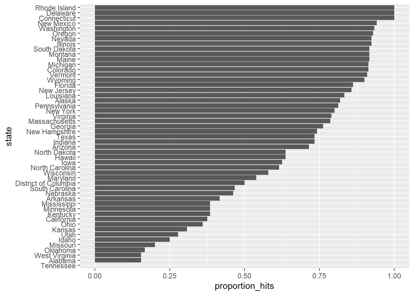
5- Plotting Prediction Results
Make a barplot based on the result from the previous exercise.
- Reorder the states in order of the proportion of hits.
- Using ggplot, set the aesthetic with state as the x-variable and proportion of hits as the y-variable.
- Use geom_bar to indicate that we want to plot a barplot. Specifcy stat = "identity" to indicate that the height of the bar should match the value.
- Use coord_flip to flip the axes so the states are displayed from top to bottom and proportions are displayed from left to right.
head(p_hits)
# Make a barplot of the proportion of hits for each state
p_hits %>% mutate(state = reorder(state, proportion_hits)) %>%
ggplot(aes(state, proportion_hits)) +
geom_bar(stat = "identity") +
coord_flip()
6 - Predicting the Winner
Even if a forecaster's confidence interval is incorrect, the overall predictions will do better if they correctly called the right winner.
Add two columns to the cis table by computing, for each poll, the difference between the predicted spread and the actual spread, and define a column hit that is true if the signs are the same.
- Use the mutate function to add two new variables to the cis object: error and hit.
- For the error variable, subtract the actual spread from the spread.
- For the hit variable, return "TRUE" if the poll predicted the actual winner. Use the sign function to check if their signs match - learn more with ?sign.
- Save the new table as an object called errors.
- Use the tail function to examine the last 6 rows of errors.
head(cis)
# Create an object called `errors` that calculates the difference between the predicted and actual spread and indicates if the correct winner was predicted
errors <- cis %>% mutate(error = spread - actual_spread,
hit = sign(spread) == sign(actual_spread))
# Examine the last 6 rows of `errors`
tail(errors)
7 - Plotting Prediction Results
Create an object called p_hits that contains the proportion of instances when the sign of the actual spread matches the predicted spread for states with 5 or more polls.
- Make a barplot based on the result from the previous exercise that shows the proportion of times the sign of the spread matched the actual result for the data in p_hits.
- Use the group_by function to group the data by state.
- Use the filter function to filter for states that have 5 or more polls.
- Summarize the proportion of values in hit that are true as a variable called proportion_hits. Also create a variable called n for the number of polls in each state using the n() function.
- To make the plot, follow these steps:
- Reorder the states in order of the proportion of hits.
- Using ggplot, set the aesthetic with state as the x-variable and proportion of hits as the y-variable.
- Use geom_bar to indicate that we want to plot a barplot.
- Use coord_flip to flip the axes so the states are displayed from top to bottom and proportions are displayed from left to right.
errors <- cis %>% mutate(error = spread - actual_spread, hit = sign(spread) == sign(actual_spread))
# Create an object called `p_hits` that summarizes the proportion of hits for each state that has 5 or more polls
p_hits <- errors %>% group_by(state) %>%
filter(n() >= 5) %>%
summarize(proportion_hits = mean(hit), n = n())
# Make a barplot of the proportion of hits for each state
p_hits %>% mutate(state = reorder(state, proportion_hits)) %>%
ggplot(aes(state, proportion_hits)) +
geom_bar(stat = "identity") +
coord_flip()
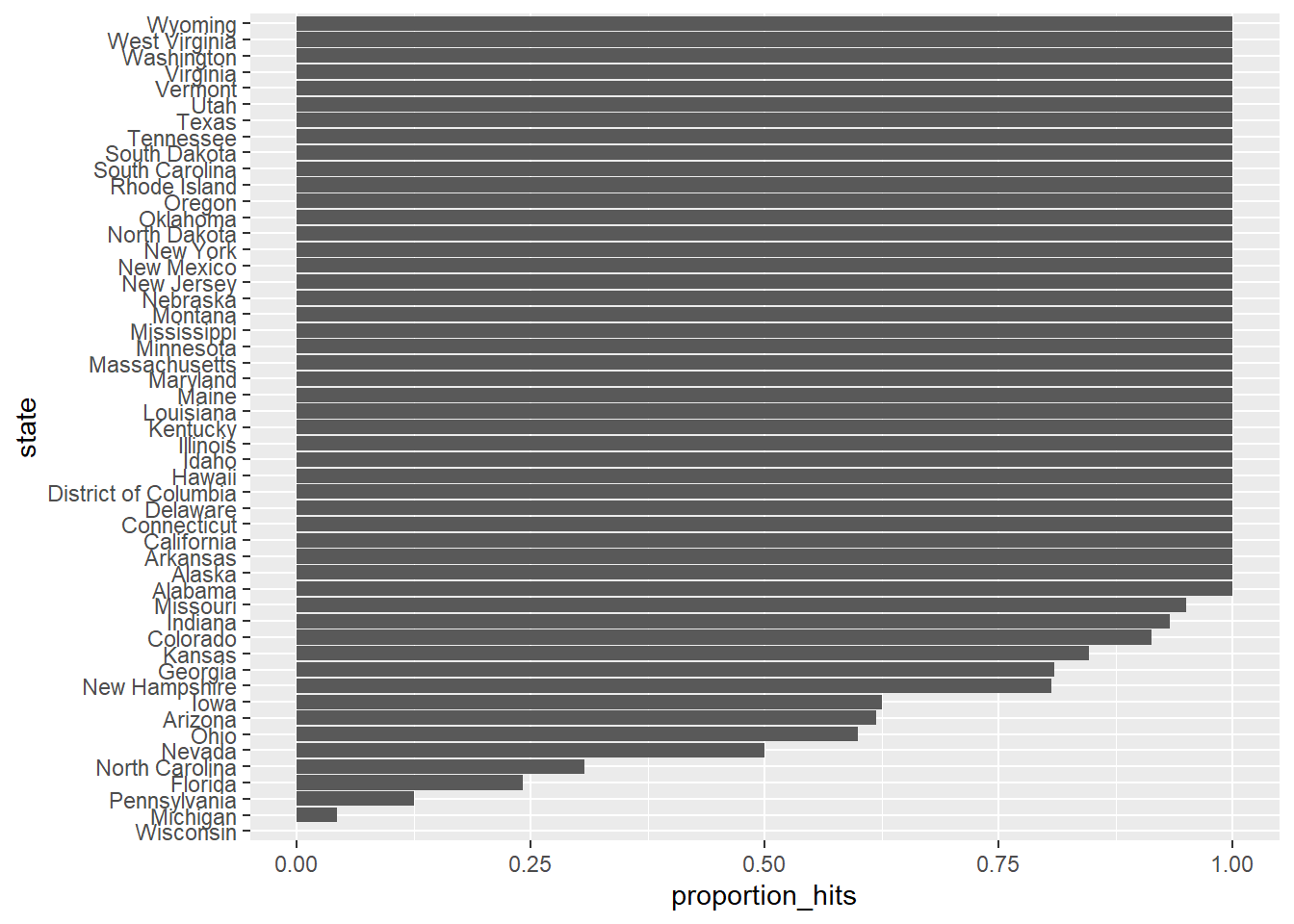
8 - Plotting the Errors
In the previous graph, we see that most states' polls predicted the correct winner 100% of the time. Only a few states polls' were incorrect more than 25% of the time. Wisconsin got every single poll wrong. In Pennsylvania and Michigan, more than 90% of the polls had the signs wrong.
- Use the hist function to generate a histogram of the errors
- Use the median function to compute the median error
Make a histogram of the errors. What is the median of these errors?
head(errors)
# Generate a histogram of the error
hist(errors$error)
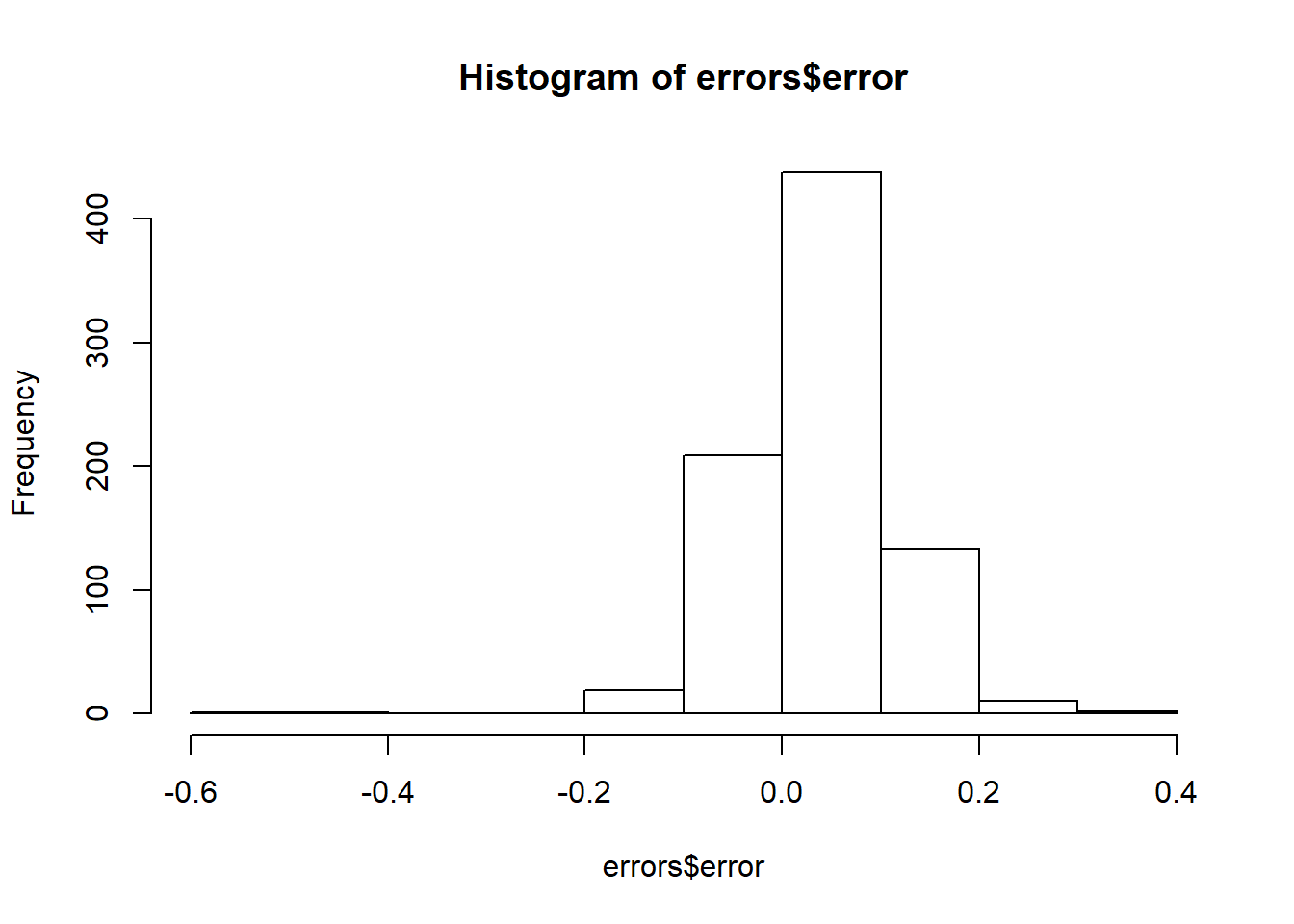
median(errors$error)
[1] 0.037
9- Plot Bias by State
We see that, at the state level, the median error was slightly in favor of Clinton. The distribution is not centered at 0, but at 0.037. This value represents the general bias we described in an earlier section.
Create a boxplot to examine if the bias was general to all states or if it affected some states differently. Filter the data to include only pollsters with grades B+ or higher.
- Use the filter function to filter the data for polls with grades equal to A+, A, A-, or B+.
- Use the reorder function to order the state data by error.
- Using ggplot, set the aesthetic with state as the x-variable and error as the y-variable.
- Use geom_boxplot to indicate that we want to plot a boxplot.
- Use geom_point to add data points as a layer.
head(errors)
# Create a boxplot showing the errors by state for polls with grades B+ or higher
errors %>% filter(grade %in% c("A+","A","A-","B+") | is.na(grade)) %>%
mutate(state = reorder(state, error)) %>%
ggplot(aes(state, error)) +
theme(axis.text.x = element_text(angle = 90, hjust = 1)) +
geom_boxplot() +
geom_point()
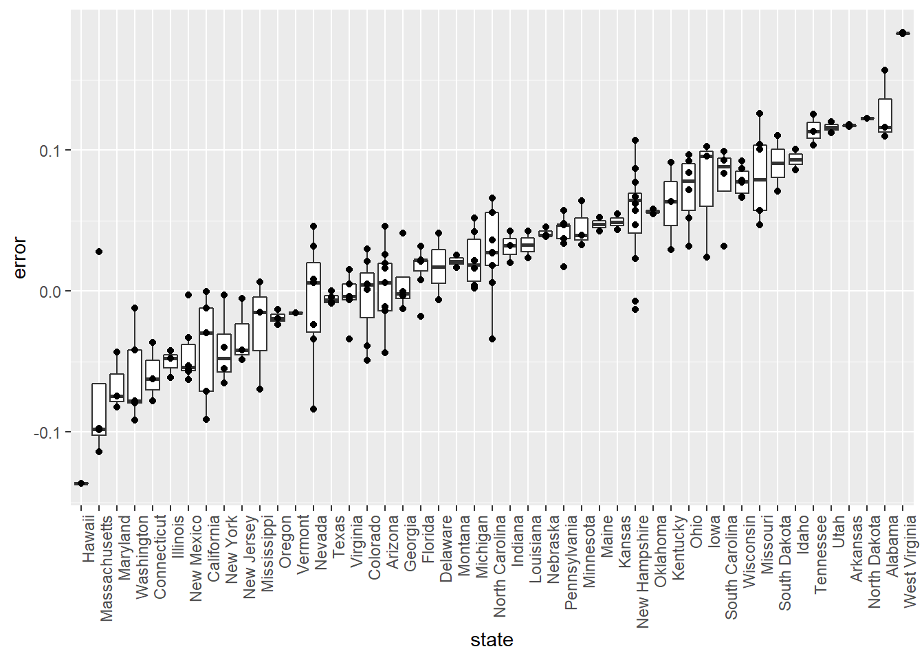
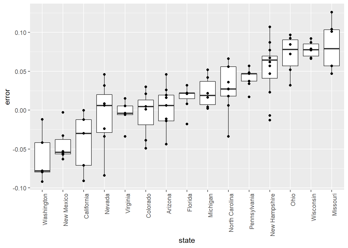
10 - Filter Error Plot
Some of these states only have a few polls. Repeat the previous exercise to plot the errors for each state, but only include states with five good polls or more.
- Use the filter function to filter the data for polls with grades equal to A+, A, A-, or B+.
- Group the filtered data by state using group_by.
- Use the filter function to filter the data for states with at least 5 polls. Then, use ungroup so that polls are no longer grouped by state.
- Use the reorder function to order the state data by error.
- Using ggplot, set the aesthetic with state as the x-variable and error as the y-variable.
- Use geom_boxplot to indicate that we want to plot a boxplot.
- Use geom_point to add data points as a layer.
head(errors)
# Create a boxplot showing the errors by state for states with at least 5 polls with grades B+ or higher
errors %>% filter(grade %in% c("A+","A","A-","B+") | is.na(grade)) %>%
group_by(state) %>%
filter(n() >= 5) %>%
ungroup() %>%
mutate(state = reorder(state, error)) %>%
ggplot(aes(state, error)) +
theme(axis.text.x = element_text(angle = 90, hjust = 1)) +
geom_boxplot() +
geom_point()